A good service landing page does one job. It takes a visitor who searched for a specific service, confirms they are in the right place, and makes the next step obvious. Design, copy and proof all serve that one action, whether it is a call, a booking or a quote request. Below you’ll find the layout we use, the copy rules that matter, how a landing page differs from a homepage, and what a local business should add so the page works in search as well.
TL;DR
- A service landing page promotes one service and pushes one action. Everything that doesn’t support that action gets cut or moved down.
- Lead with a benefit headline, name the problem, explain the service, show proof, then repeat a specific call to action.
- Write buttons that say exactly what happens next, such as “Request a Free Quote”, not “Get Started”.
- Your homepage introduces the whole business. A landing page closes one conversation.
- Local businesses should add the city, phone number, hours, service area and LocalBusiness structured data.
Table of Contents
- What a service landing page is (and what it is not)
- Landing page vs. homepage: when to use which
- The layout that works, section by section
- Visual design rules that support conversion
- How much navigation should you keep?
- Service page copywriting: say it plainly
- Making the page work for local search
- Common mistakes on weak service landing pages
- Our perspective: design is a business decision
- How we can help
- A quick checklist before you publish
- FAQ
- Sources
What a service landing page is (and what it is not)
A service landing page describes and explains one specific service or offer, with the aim of making the right audience want to buy it. Search Engine Land frames service pages this way. The key word is one. A page that tries to sell plumbing, HVAC, water heaters and a maintenance plan all at once sells none of them well.
Think of an unfocused page as a storefront with locked doors and the lights off. People may walk past, but nobody comes in. A focused landing page is the opposite: one door, clearly lit, with a sign that says what you’ll find inside.
There are two common situations where you build one:
- Paid traffic. Someone clicks a search or social ad and lands on a page that matches the ad’s promise.
- Organic traffic. Someone searches for “roof repair Albuquerque” and finds a page built entirely around that service.
The design principles are nearly identical in both cases. The difference is how much navigation you keep, which we cover below.
Landing page vs. homepage: when to use which
Your homepage has a broad job. Nielsen Norman Group describes effective homepages as communicating the organization’s purpose, showing engaging content, guiding users toward their goals, and reflecting what the site offers. That makes a homepage a lobby: many visitors, many reasons for being there, many doors.
A service landing page is a private meeting room. The visitor already knows roughly what they want. You are not introducing yourself to the world, you are answering one question: can you do this for me, and what do I do next?
| Homepage | Service landing page | |
|---|---|---|
| Audience | Everyone: customers, job seekers, partners | People looking for one specific service |
| Goal | Orient and route visitors | Get one action |
| Navigation | Full menu | Reduced, sometimes removed |
| Content | Overview of the business | Depth on a single service |
| Traffic source | Brand searches, direct visits | Service searches and ads |
When to use a landing page: any time you can name a single service, a single audience and a single desired action. If you run ads, you almost always want a dedicated page per service rather than sending clicks to your homepage. If you only have one page for everything, you are asking a visitor to do the sorting for you, and most won’t.
Our guide to landing page conversion rate optimization goes deeper on measuring what happens after the visitor arrives.
The layout that works, section by section
Most high-performing service pages follow the same logic, because visitors process them the same way: Is this for me? Does it solve my problem? Can I trust you? What do I do? Here is the order we recommend.
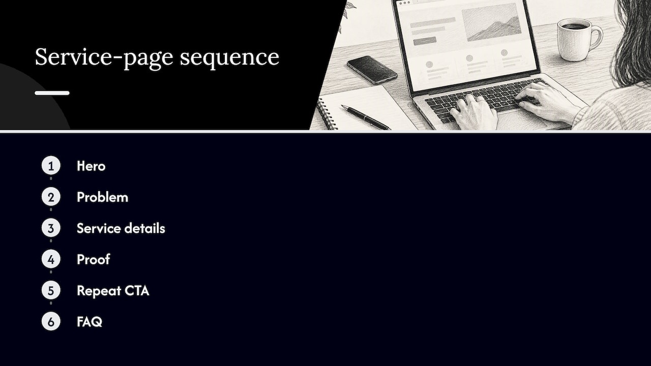
1. Hero: the service, the benefit, the action
Above the fold, a visitor should see three things: what the service is, who it’s for (including the city, if you work locally), and a primary call to action. The headline states a benefit, not a category. “Water heater repair in Albuquerque, same-day when you call before noon” is stronger than “Plumbing Services”, provided it is true for your business.
If a phone call is how you close work, put the number in the hero and make it tappable on mobile.
2. The problem, in the visitor’s words
Open the body with the problem your visitor has right now. Cold showers. Leads that don’t call back. A website that looks fine but never rings the phone. Naming the problem proves you understand the situation before you start selling the fix.
3. What the service includes and why it helps
This is the core explanation. Cover what is included, how it works, who it fits, and the practical details people worry about: timing, what you need from them, how communication works and how payment works. Use short paragraphs, meaningful subheadings and bullets. Search Engine Land recommends scannable service pages with clear headings, lists, short paragraphs, readable type, whitespace, strong contrast, fast loading and prominent CTAs.
A simple process section works well here: three or four numbered steps from first contact to finished job. It lowers anxiety because the buyer can see what happens.
4. Proof
This is where trust gets built or lost. Use real reviews with names and, where you have permission, photos. Add specifics: years in business, licenses, certifications and guarantees you can actually stand behind. Put proof close to a call to action, because that is the moment the visitor is deciding.
Don’t invent testimonials or inflate numbers. A handful of genuine, detailed reviews beats a wall of vague praise. If you need more reviews to show, that is a separate project worth doing first.
5. Repeat the call to action
Don’t make people scroll back to the top. Place a CTA after the benefits, again after the proof, and once more at the bottom. On mobile, make buttons large enough to tap without zooming.
6. FAQ and objections
A short FAQ answers the questions that stop people from acting: price ranges, timing, service area, what happens if something goes wrong. If a question comes up on every sales call, it belongs on the page.
Visual design rules that support conversion
Design on a service landing page exists to direct attention. A few principles carry most of the weight.
Design around the page’s objective. NN/G’s web page design curriculum stresses matching visual design to content priority, with hierarchy, contrast and responsive breakpoints in support of that objective. In practice: the biggest, boldest element is your headline, the most colorful element is your button, and nothing else competes with either.
Use one primary button color. If every element is bright, nothing stands out. Reserve your accent color for the action.
Choose real imagery. Photos of your actual team, trucks, shop or finished work do more than stock images of smiling strangers. Visitors can usually tell the difference.
Design for the phone first. For many local services, the visitor is on a phone, often urgently. Check that the headline, phone number and button show without scrolling, that text is readable without pinching and that forms are short.
Keep it fast. Heavy sliders, autoplay video and oversized images cost you visitors before they read a word. Our guide to high-converting website components covers the building blocks in more detail.
How much navigation should you keep?
This is the most debated design question on landing pages. The answer depends on where the traffic comes from.
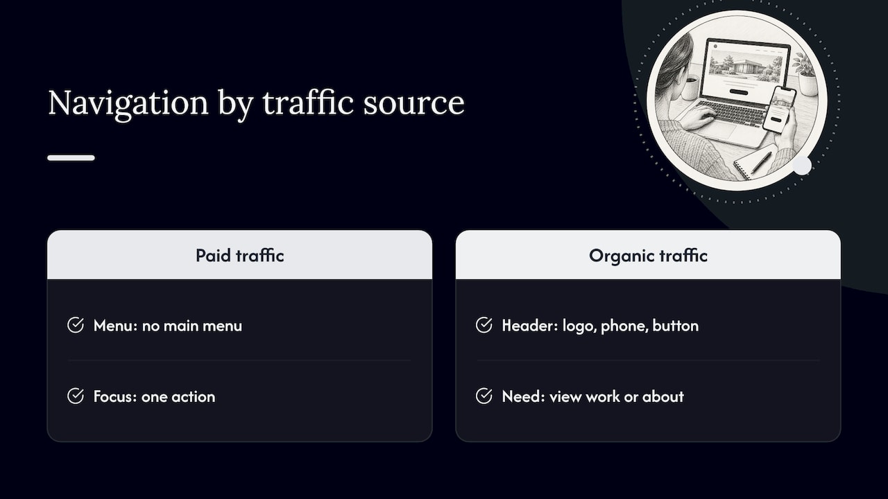
For paid campaigns, a stripped-down page with no main menu keeps visitors focused on the one action. For organic service pages, where visitors may also want to see your other work or your about page, a light header with your logo, phone number and a button usually works better, and it also helps search engines and visitors move through your site.
There is evidence for the focused approach. In a MarketingExperiments test, a single-column long-form page with the value proposition emphasized and navigation removed produced a 220% higher conversion rate than the short-form control, at 98% confidence. Treat that as a reason to test, not a promise. It was one test, on one audience, in 2013. Your result will depend on your service, your price point and your traffic. See our walkthrough on A/B testing landing pages for small businesses for how to test without wasting budget.
The same test is also a useful reminder that longer is not automatically worse. A page should be as long as it takes to answer the buyer’s questions, and no longer.
Service page copywriting: say it plainly
Good website copywriting on a service page is not clever. It is clear, specific and written for one person. Here is what we focus on.
Write to one reader
Decide who the page is for before you write a word. A page for a homeowner with an emergency leak reads differently from a page for a property manager comparing maintenance vendors. State who the service is for early, so the right visitor recognizes themselves and the wrong one leaves quickly.
Lead with outcomes, support with features
Visitors buy results. “We inspect every line with a camera” is a feature. “You’ll know exactly what’s wrong before you approve any work” is the outcome. Use the feature as proof for the outcome.
Keep it as long as the decision needs
A few hundred words of real explanation is a sensible starting point for a straightforward service: who it’s for, why it helps and how it works. Higher-priced or more complex services need more room. Cut anything that doesn’t help the reader decide.
Make the call to action a promise
NN/G warns that vague labels like “Get Started” can mislead users, and that button text should state exactly what the user should expect. A CTA is a promise, so an ambiguous label can damage trust even when it earns clicks.
The companion rule: the destination must confirm the promise. NN/G’s principle that a link is a promise means that if the button says “Schedule a Free Estimate”, the next screen should be a scheduling form, not a general contact page.
| Weak label | Stronger label | Why |
|---|---|---|
| Get Started | Request a Free Quote | Says what you get |
| Submit | Book My Appointment | Describes the result |
| Learn More | See Pricing Options | Sets an expectation |
| Contact Us | Call Now: (505) 555-0100 | Makes the action concrete (example number) |
For more on button language and placement, see our guide to call-to-action strategies that drive conversions.
Match the search intent
The words on the page should match what the visitor typed. Someone searching “emergency AC repair” wants speed and availability. Someone searching “AC installation cost” wants ranges and financing. Our explainer on search intent shows how to read the difference and build the page around it.
Making the page work for local search
If you serve a specific area, the page has to say so clearly, to people and to search engines. Google’s SEO Starter Guide explains that SEO helps search engines understand your content and helps users decide whether to visit. It also makes clear that useful optimization starts with content made for people.
For a local service page, that means:
- The service and the city in the headline and opening paragraph, written naturally.
- A visible phone number, hours and service area, so visitors don’t hunt for them.
- A short contact form, asking only what you need to follow up.
- Real local detail: neighborhoods you serve, local projects, local reviews.
- No unrelated sidebar content pulling attention away from the action.
On the technical side, Google’s documentation says LocalBusiness structured data can communicate your business name, address, hours, coordinates, price range and other details to Search and Maps. Google also advises using the most specific business subtype available, including the required properties, validating the markup with the Rich Results Test and checking the page with URL Inspection before you deploy it.
If you serve several cities, resist the urge to clone one page and swap the city name. Our guide to local SEO location pages explains how to make each one genuinely useful. And for the wider picture, see our guide to search-engine-friendly website design.
Common mistakes on weak service landing pages
We see the same problems again and again when we review local business sites.
- Too many services on one page. The visitor can’t tell what you want them to do.
- A headline that names the category, not the benefit. “Our Services” tells nobody anything.
- No proof near the action. Reviews buried on a separate page don’t help at the moment of decision.
- Vague buttons. “Submit” and “Get Started” leave people guessing.
- Long forms. Every extra field costs you leads. Ask for name, phone and what they need.
- Slow mobile pages. If the page takes too long, the visitor is gone.
- No tracking. If you can’t tell which calls and forms came from the page, you can’t improve it.
Our perspective: design is a business decision
We started King Digital because we were business owners ourselves, frustrated with big agencies that handed over reports nobody could act on. That experience shapes how we think about landing pages.
A landing page is not an art project. It is a salesperson that works at 2 a.m. If it doesn’t earn its keep, it needs to change, and you should be able to see that from your own data. That is why we insist on transparent, data-driven work, direct communication, and full access to your accounts. We don’t lock clients into long-term contracts or hold anything back.
Our advice is almost always the same: pick one service, one audience and one action, build the clearest page you can, track every call and form, then improve it with evidence. Skip the redesign that takes six months. Fix the headline, the proof and the button first, and measure.
— Bernadette
How we can help
If you’d rather have an experienced team build and tune your service pages, that is what we do for small and mid-sized businesses in Albuquerque and beyond. Our SEO-friendly web design work covers page structure, copy and conversion tracking together, so your landing pages are built to rank and to produce leads.

We can also review the pages you already have, point out what is costing you leads, and show you where your marketing budget is best spent. Browse all of our digital marketing services or talk to us about your site.
A quick checklist before you publish
Run your page through these questions:
- Does the headline name the service, the benefit and, if local, the city?
- Is there one primary action, and does every button say exactly what it does?
- Can a visitor on a phone see the call to action without scrolling?
- Is there real proof (reviews, credentials, guarantees) within reach of each CTA?
- Does the page explain who the service is for, how it works and what it involves?
- Is the form as short as it can be?
- Is structured data in place and validated, and does the page load quickly?
- Are calls, form fills and bookings tracked back to this page?
If you can answer yes to all eight, you have a page worth sending traffic to.
FAQ
What is a service landing page?
It is a page on your website that focuses on one specific service and encourages one action, such as booking, calling or requesting a quote. It explains who the service is for, how it helps and why the visitor should trust you. Unlike a homepage, it doesn’t try to cover your whole business.
What is the difference between a landing page and a homepage?
A homepage introduces your whole organization and routes many kinds of visitors to the right place. A landing page serves a single audience with a single goal and usually limits navigation to keep attention on one action. Use a landing page whenever you can name one service, one audience and one outcome, especially when you run ads.
How long should service page copy be?
Long enough to answer the buyer’s real questions: who it’s for, what’s included, how it works, what it costs or how pricing works, and what happens next. A simple service may need only a few hundred words, while a high-ticket or complex one needs more. Use headings and bullets so the page stays easy to scan.
What should the call to action say?
It should state exactly what happens when the visitor clicks, such as “Request a Free Quote” or “Schedule My Appointment”. Generic labels like “Get Started” leave people unsure and can erode trust. Make sure the next page delivers on the promise the button made.
Do local businesses need a separate landing page for each service?
In most cases, yes. A dedicated page lets you match the search intent, speak to one audience and track results for that service. If you serve multiple cities, give each location page its own useful local detail rather than copying the same text.
Sources
- How to create service pages that rank and convert, Search Engine Land
- Homepage Design: 5 Fundamental Principles, Nielsen Norman Group
- Web UX Design course, Nielsen Norman Group
- Web Usability: Long landing page nets 220% more leads, MarketingExperiments
- “Get Started” Stops Users, Nielsen Norman Group
- A Link is a Promise, Nielsen Norman Group
- SEO Starter Guide, Google Search Central
- Local Business Structured Data, Google Search Central
Recommended
- High-Converting Website Components: The 2026 Practitioner’s Guide
- The Complete Guide to Landing Page Conversion Rate Optimization
- A/B Testing Landing Pages for SMBs: Agency Tested, Guardrail First
- Explaining Call-to-Action Strategies That Drive Real Conversions
