Why Your Website’s Search Engine Visibility Matters More Than Ever
Search engine friendly website design is the practice of creating websites that search engines can easily crawl, understand, and rank while providing an excellent user experience. Here’s what makes a website search engine friendly:
Essential Elements:
- Clean, crawlable site structure with logical navigation
- Fast loading speeds and mobile-responsive design
- Optimized content with proper title tags, meta descriptions, and headings
- Technical foundations including HTTPS, XML sitemaps, and structured data
- User-focused design that reduces bounce rates and increases engagement
The stakes couldn’t be higher. Research shows that the first search result on Google captures over 25% of all clicks, while mobile devices now generate nearly 59% of global website traffic. Even more telling: 48% of people judge a business’s credibility based on website design alone.
The challenge most business owners face is that search engines and users want the same thing: fast, accessible, trustworthy websites that deliver value. When you design with both in mind, every dollar invested in user experience can return $100 – an ROI of 9,900%.
This isn’t just about ranking higher. It’s about creating a digital presence that actually converts visitors into customers. When your website is truly search engine friendly, you’re building trust, authority, and sustainable growth.
I’m Bernadette King, founder of King Digital Marketing Agency. I’ve spent years helping businesses transform their online presence through strategic search engine friendly website design, turning struggling local businesses into market leaders.
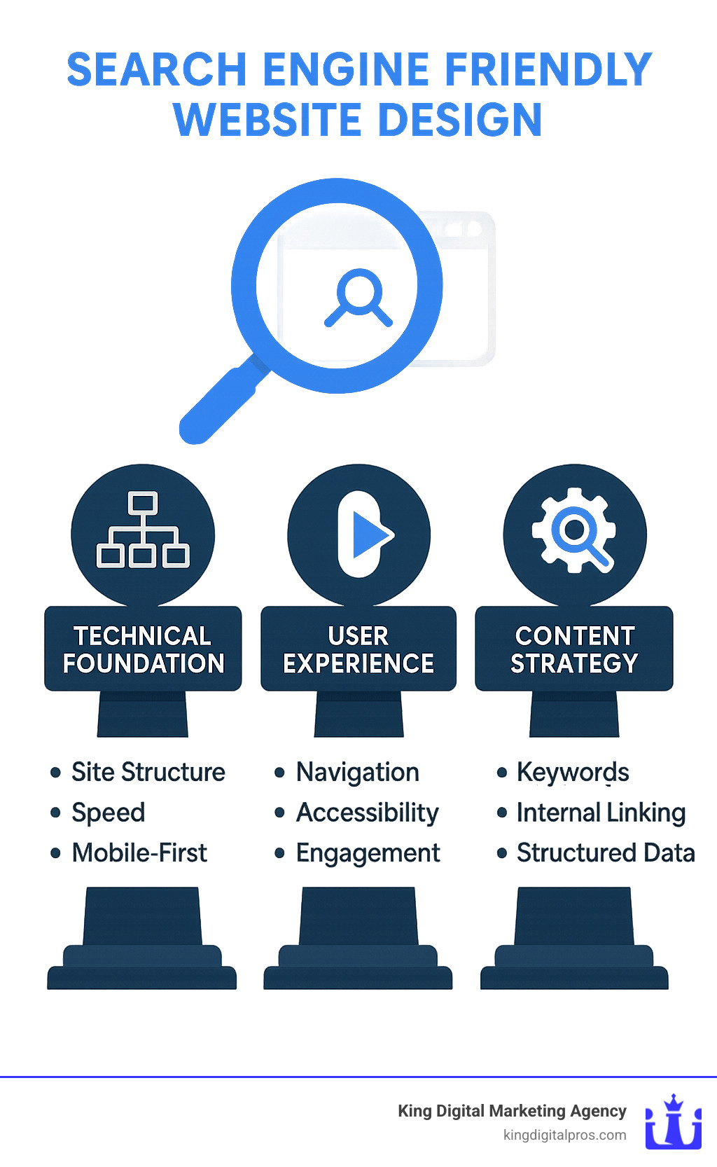
What Is Search Engine Friendly Website Design?
Search engine friendly website design means building a site that bots can crawl and people can enjoy. Google’s crawlers need clear paths, clean code, and meaningful content; visitors want speed, clarity, and trust. The sweet spot is a layout that serves both.
Modern algorithms heavily weight user signals, so a site that loads fast, works on every screen, and answers real questions will normally outrank a pretty page that ignores basic UX. That alignment is spelled out in Google’s Quality Evaluator Guidelines and the E-E-A-T framework—Experience, Expertise, Authoritativeness, Trustworthiness.
Key requirements at a glance:
- Crawlable architecture with logical internal links
- Mobile-first templates that satisfy Core Web Vitals
- Secure HTTPS hosting, properly configured XML sitemaps and robots.txt
- Content that demonstrates expertise and uses descriptive title tags, headings, and meta information
At King Digital Marketing Agency, we’ve rebuilt dozens of sites that once hid behind fancy graphics or bloated code. After stripping out barriers and focusing on speed and clarity, clients routinely see organic traffic rise 30-50 % within months.
Why Designing With SEO From Day One Matters
Trying to “bolt on” SEO after launch is like rewiring a house after the drywall is up—possible but expensive. Sites that start with an SEO blueprint tend to:
- Capture up to 32 % of clicks for priority search terms
- Build lasting authority because technical foundations rarely need to be re-done
- Adapt more easily to Google’s hundreds of annual updates
How Search Engines Crawl & Index
Googlebot follows internal links to find pages, checks the XML sitemap for a master list, and obeys any robots.txt rules. Use Google Search Console’s URL Inspection Tool—or simply search site:yourdomain.com—to confirm that your important pages are indexed. Thoughtful internal linking then distributes ranking power to the rest of your content.
Core Elements of an SEO-Friendly Site Structure
Building a search engine friendly website design is like constructing a house – you need a solid foundation before you can add the finishing touches. The way you organize and structure your website’s content directly impacts how both search engines and visitors steer your site.
Think of your website’s information architecture as a well-organized filing system. Every piece of content should have a logical home, and visitors should be able to find what they’re looking for without getting lost.
When planning your site structure, you’ll encounter two main approaches: flat architecture and silo architecture. Flat architecture keeps most pages within a few clicks of your homepage, making it ideal for smaller websites. Silo architecture groups related content into themed sections, creating topical authority that search engines love – perfect for larger sites.
| Architecture Type | Best For | Pros | Cons |
|---|---|---|---|
| Flat Architecture | Small sites (under 100 pages) | Simple navigation, equal page authority | Can become cluttered |
| Silo Architecture | Large sites, topical authority | Clear content organization, better for SEO | More complex setup |
The three-click rule serves as your north star here. Any important page should be reachable within three clicks from your homepage. This signals to search engines which pages matter most on your site.
Breadcrumb navigation acts like a trail of digital breadcrumbs, showing users exactly where they are. Search engines use this information to better understand your site’s hierarchy and page relationships.
Your URLs should tell a story too. Clean URLs that include relevant keywords and follow a logical structure make life easier for everyone. Instead of cryptic strings of numbers, use descriptive URLs that give both users and search engines clear context.
Canonical tags solve duplicate content issues by telling search engines which version should be considered the authoritative source. Schema markup provides search engines with rich context about what your pages actually mean, not just what they say.
Your XML sitemap serves as a comprehensive roadmap of your website, making it effortless for search engines to find and crawl all your important pages.
URL Best Practices for Search Engine Friendly Website Design
Creating effective URLs is like giving clear directions – they should be simple, descriptive, and easy to follow. The best URLs immediately tell both users and search engines exactly what they’ll find on that page.
Short slugs work better than long, complicated ones. Instead of “www.yoursite.com/page1?id=12345”, use “www.yoursite.com/seo-web-design”. Always use hyphens to separate words in your URLs, not underscores. Including your primary keyword in the URL gives you a valuable SEO boost.
HTTPS isn’t optional anymore – it’s essential. Google has confirmed that secure sites get a ranking boost, and modern browsers warn users about non-secure sites.
Sitemaps & Robots Directives
XML sitemaps are like giving search engines a detailed map of your website. They provide a comprehensive list of all your pages, along with information about when each page was last updated and how important it is.
Most modern content management systems can auto-generate maps, but take time to review and customize your sitemap with priority levels and last modification dates to help search engines understand which pages to crawl first.
Your robots.txt file controls which areas search engines can access. The allow and disallow rules are powerful but easy to mess up. One common mistake is accidentally blocking CSS and JavaScript files that search engines need to properly render your pages.
For businesses serious about their online presence, our Website Hosting and Maintenance services ensure all these technical elements are properly configured and monitored.
User Experience, Mobile-Friendliness & Performance
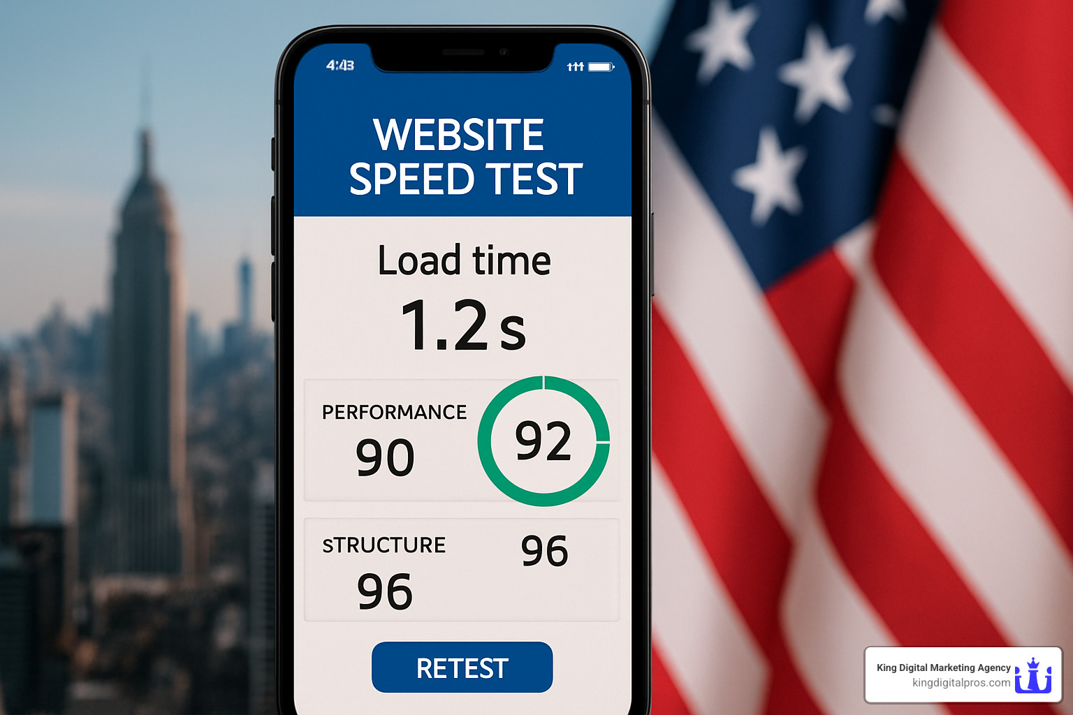
Search engines now evaluate pages largely through the lens of real-world use—especially on phones. Google’s mobile-first indexing treats your mobile layout as the primary version of the site, so speed and usability on small screens are non-negotiable.
Why it matters:
- 6.4 billion people browse the web on mobile devices
- A 1-second delay can lower conversions by 7 %
- Core Web Vitals (Largest Contentful Paint, Interaction to Next Paint, Cumulative Layout Shift) are confirmed ranking factors
Mobile Design Principles
- Use the viewport meta tag and fluid grids so layouts stretch or shrink gracefully.
- Make tap targets at least 44 × 44 px and show critical info (phone, directions, CTA) above the fold.
- Test on real devices—not just emulators—to check legibility and gesture controls.
Speed Optimisation Checklist
- Compress and next-gen-format images (WebP, AVIF) and enable lazy loading.
- Minify CSS/JavaScript and serve assets through a Content Delivery Network (CDN).
- Keep server response times under 200 ms and leverage browser caching.
Run Google PageSpeed Insights or the open-source WebPageTest for an instant health report.
Accessibility & UX Signals
Good accessibility improves SEO and expands your market to the estimated 1 billion people worldwide living with a disability. At minimum:
- Maintain contrast ratios of 4.5 : 1 for text.
- Add descriptive alt text and ARIA labels to interactive elements.
- Structure headings in logical order (H1 → H2 → H3).
Tools such as Wix’s Accessibility Wizard or the free axe browser extension can scan for violations in minutes.
Better accessibility, faster pages, and thoughtful mobile layouts send positive engagement signals—lower bounce rates, longer dwell time—that search engines reward with higher visibility.
On-Page SEO, Content & Internal Linking
On-page optimisation is your chance to tell both users and algorithms exactly what a page offers.
Fast checklist:
- Title tag ≤ 60 characters, keyword near the front, written for clicks
- Meta description ≤ 160 characters, persuasive and unique
- Clean heading hierarchy (H1 once, logical H2/H3)
- Descriptive alt text for every meaningful image
- Outbound links to authoritative sources such as Search Engine Journal add credibility
Google evaluates page quality through its E-E-A-T lens. Demonstrate it with clear author bios, citations, case studies, and up-to-date insights.
Crafting High-Quality Content
Forget keyword stuffing. Instead:
- Map user questions with tools like People Also Ask and turn them into concise sub-sections.
- Build topic clusters: a pillar page that covers the subject broadly, then interlink to focused supporting pieces.
- Enrich pages with images, video, or infographics—media files give you additional search surfaces on Google Images and YouTube.
Our Copywriting team uses this framework to turn static brochure sites into searchable libraries that attract qualified visitors.
Internal Linking & Navigation
Strategic links guide both crawlers and customers:
- Use anchor text that describes what’s behind the click (e.g., “conversion optimisation tips” rather than “click here”).
- Breadcrumb trails expose site hierarchy and help users jump back up a level.
- Keep important pages within three clicks of the homepage.
Structured Data & Rich Snippets
Schema.org markup translates page content into a language search engines interpret instantly, opening the door to rich snippets such as star ratings, FAQs, and product availability.
Start with Organization, LocalBusiness, Review, and FAQ schema. You can generate valid code with schema.dev and test it in Google’s Rich Results Test before publishing.
Done right, schema can lift click-through rates by up to 30 % because your listing stands out visually.
Measuring, Testing & Iterating
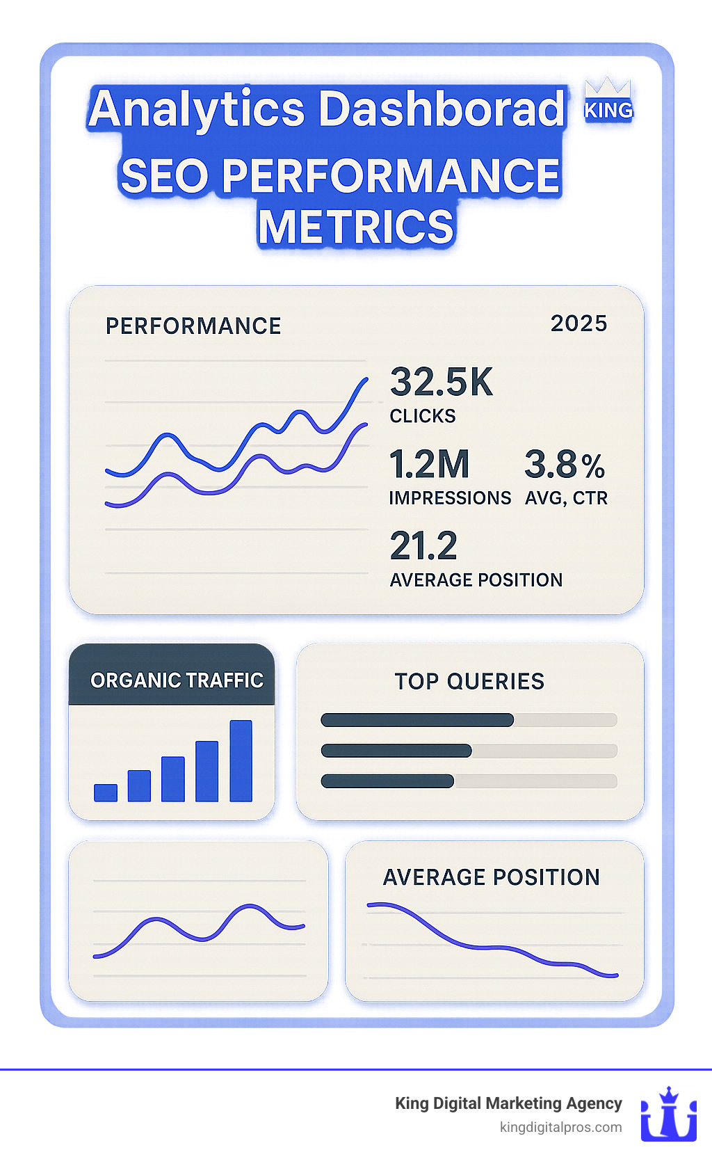
A search-optimised site is never “set and forget.” Ongoing measurement lets you spot problems before they cost rankings.
Essential tool stack:
- Google Search Console for crawl, index, and query data
- Google Analytics (GA4) for behaviour, conversion paths, and dwell time
- Core Web Vitals monitoring (built into Search Console and PageSpeed Insights)
- Heat-mapping software like Microsoft Clarity
- Periodic crawls with Screaming Frog or Sitebulb to catch broken links and duplicate content
Using Analytics to Improve Performance
Interpret data in context. A high bounce rate on a quick-answer FAQ page may be fine; on a service page, it signals deeper issues. Track:
- Organic traffic and impressions over time
- Keyword positions for key terms
- Conversion events (form submissions, calls, check-outs)
Sites we redesign and optimise typically see a 2–3 × increase in qualified leads within six months.
Common Mistakes to Avoid
- Keyword stuffing and thin content
- Slow, under-powered hosting
- Intrusive pop-ups, especially on mobile
- Duplicate or orphaned pages
- Neglecting HTTPS security
Our free Must-Have Marketing Tools guide walks you through the set-ups we rely on for every client.
Frequently Asked Questions About Search Engine Friendly Website Design
What technical SEO steps must be addressed during design?
When you’re building a website from scratch, there are several non-negotiable technical elements that need to be baked into your search engine friendly website design from day one. Think of these as the foundation of your digital home – you can’t add them as an afterthought without major reconstruction.
HTTPS security is your first priority. Google has made it clear that secure websites get a ranking boost, and modern browsers actually warn users when they visit non-secure sites. Your visitors need to trust that their information is safe, especially if you’re collecting leads or processing payments.
Clean URL structures and proper crawling capabilities go hand in hand. Your URLs should be readable by humans and search engines alike – “yoursite.com/seo-friendly-design” beats “yoursite.com/page123?id=xyz” every time. Make sure your XML sitemap is properly configured and your robots.txt file isn’t accidentally blocking important pages.
Structured data markup might sound technical, but it’s like giving search engines a roadmap to understand your content better. When you mark up your business information, reviews, or FAQ sections, you’re increasing your chances of appearing in rich snippets and local search results.
Don’t forget about mobile-first design and fast loading speeds. With Google’s mobile-first indexing, your mobile version is what gets evaluated first. If your site takes more than three seconds to load, you’re losing both visitors and search rankings.
How do I balance creativity with search requirements?
Here’s the good news: search engine friendly website design doesn’t mean boring design. The secret is starting with user experience at the center of your planning process, then weaving in SEO best practices naturally.
Begin with UX-first wireframes that map out how real people will use your site. Where will they look for information? What actions do you want them to take? When you design for humans first, you’re already on the right track for search engines, since Google increasingly rewards sites that provide great user experiences.
Flexible templates are your friend here. Create design systems that look amazing but follow SEO-friendly structures underneath. You can have beautiful, creative layouts that still use proper heading hierarchies, include alt text for images, and load quickly across all devices.
The key is iterative testing. Launch with a design that balances both needs, then use real data to refine your approach. Heat maps can show you where users actually click, while analytics reveal which creative elements are helping or hurting your search performance.
The most creative website in the world won’t help your business if nobody can find it. But a well-optimized site that also delights visitors? That’s where the magic happens.
How can schema markup boost visibility?
Schema markup is like giving search engines a behind-the-scenes tour of your content. Instead of just reading your text and guessing what it means, search engines get clear signals about whether you’re sharing a review, listing business hours, or answering frequently asked questions.
Rich snippets are the most visible benefit of schema markup. When you see star ratings, business hours, or FAQ sections displayed directly in search results, that’s schema at work. These improved listings take up more space on the results page and naturally draw more clicks.
FAQ schema is particularly powerful for capturing featured snippets – those highlighted answer boxes that appear at the top of search results. When you structure your content to answer common questions and mark it up properly, you’re competing for that coveted “position zero” in search results.
Local business schema is essential if you serve customers in specific geographic areas. It helps your business information appear consistently across search results and can improve your visibility in local map listings. This is especially important for businesses that rely on foot traffic or serve local markets.
The beauty of schema markup is that it’s voice search ready. As more people use voice assistants to find local businesses, properly marked-up content has a better chance of being selected as the answer to spoken queries.
While schema markup requires some technical know-how, tools like schema.org provide detailed guidelines for implementation. The investment in proper markup pays dividends in improved search visibility and click-through rates.
Conclusion
Building a search engine friendly website design is like constructing a house – you need a solid foundation, beautiful architecture, and thoughtful details that make people want to stay. Throughout this guide, we’ve explored how technical excellence, user experience, and strategic content work together to create websites that search engines love and users can’t resist.
The three-pillar framework we’ve discussed isn’t just theory – it’s a practical roadmap for creating digital experiences that actually work. Your technical foundation ensures search engines can find and understand your content. Your user experience keeps visitors engaged and coming back. Your content strategy answers the questions your audience is asking.
SEO isn’t a “set it and forget it” project. Search engines release hundreds of updates each year, your competitors are constantly improving their websites, and your customers’ expectations keep evolving. The businesses that thrive online are those that treat SEO as an ongoing conversation with their audience, not a one-time checklist.
Here’s what makes the investment worthwhile: when your website is built on solid SEO principles from day one, every improvement compounds over time. Better page speed leads to happier users. Happier users lead to better engagement signals. Better engagement signals lead to higher rankings. Higher rankings lead to more qualified traffic. More qualified traffic leads to more customers.
At King Digital Marketing Agency, we’ve seen this change happen countless times. Local businesses across New Mexico – from busy Albuquerque to historic Santa Fe, growing Rio Rancho to artistic Taos – have finded that the right approach to web design can turn their website from a digital business card into a customer-generating machine.
Our expertise in local SEO and Google Business Profile optimization means we understand the unique challenges facing local businesses. We know that your website needs to work harder than your competitors’ because local customers have high expectations and plenty of options.
Ready to see what your website could become? Start with our Is Your Website Converting? assessment. This comprehensive evaluation reveals exactly where your website stands and what opportunities exist for improvement.
The most successful search engine friendly website design projects start with understanding that SEO and user experience aren’t competing priorities – they’re complementary forces that work together to create something greater than the sum of their parts.
Your website should be more than just a digital presence. It should be a growth engine that works around the clock to attract, engage, and convert your ideal customers. When you master the balance between search optimization and human connection, that’s exactly what it becomes.
