Why Mobile-Friendly Website Design for SEO Is No Longer Optional
Mobile-friendly website design for SEO is the practice of building and optimizing your website so it performs well on smartphones and tablets — and ranks higher in Google search results as a result.
Here’s what you need to know right now:
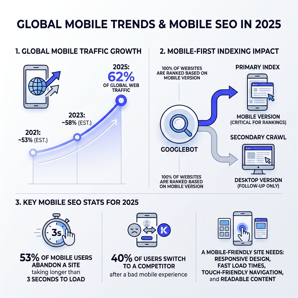
- Google indexes the mobile version of your site first — if your mobile site is slow or broken, your rankings suffer
- 62% of global web traffic comes from mobile devices in 2025
- 53% of mobile users abandon a site that takes longer than 3 seconds to load
- 40% of users switch to a competitor after a bad mobile experience
- A mobile-friendly site needs: responsive design, fast load times, touch-friendly navigation, and readable content on small screens
Picture this: a potential customer searches for your business on their phone. The text is tiny, the buttons are hard to tap, and the page takes forever to load. They leave. They go to your competitor instead. That’s not a hypothetical — it happens millions of times every day.
In 2025, mobile isn’t a secondary channel. It is the channel. Google completed its full mobile-first indexing rollout by 2024, meaning 100% of websites are now ranked based on their mobile version — not desktop. Ignore mobile, and you’re essentially invisible.
I’m Bernadette King, founder of King Digital Marketing Agency, and I’ve spent years helping local businesses turn underperforming websites into visibility-driving, customer-converting machines — including mastering mobile-friendly website design for SEO as a core part of every growth strategy. In this guide, I’ll walk you through exactly what you need to do.
Key mobile-friendly website design for seo vocabulary:
The Impact of Mobile-Friendly Website Design for SEO on Rankings
When we talk about rankings in 2025, we are talking about how Google views your site through the lens of a smartphone. This shift, known as mobile-first indexing, means that Google primarily uses the mobile version of your content for indexing and ranking. If your desktop site is a masterpiece but your mobile site is a mess, your organic traffic will plummet.
To understand how to position yourself for success, we need to look at the three main ways websites handle mobile traffic. Google has a clear favorite here.
| Configuration | Description | SEO Impact |
|---|---|---|
| Responsive Design | The same HTML/URL is served to all devices, using CSS to change the layout. | Recommended. Easiest to maintain and best for SEO. |
| Dynamic Serving | Same URL, but different HTML is served depending on the device. | High maintenance; prone to errors and “cloaking” risks. |
| Separate URLs | Different URLs (e.g., m.example.com) for mobile users. | Outdated; creates duplicate content issues and requires complex tagging. |
As we often discuss when helping clients with a Small Business Web presence, responsive design is the gold standard. It aligns with the W3C’s standards for responsive web design, ensuring that your “content parity” is maintained—meaning the text, images, and links on your mobile site match your desktop site exactly.
Google’s smartphone agent (the crawler) is what “sees” your site. If you hide important text behind “Read More” buttons that don’t load properly on mobile, or if your mobile metadata is different from your desktop metadata, Google won’t give you full credit for your content. This directly affects your search visibility. For businesses in areas like Albuquerque or Santa Fe, where local competition is fierce, losing rank because of a technical mobile glitch is a mistake you can’t afford to make.
Technical Optimization and Performance Auditing
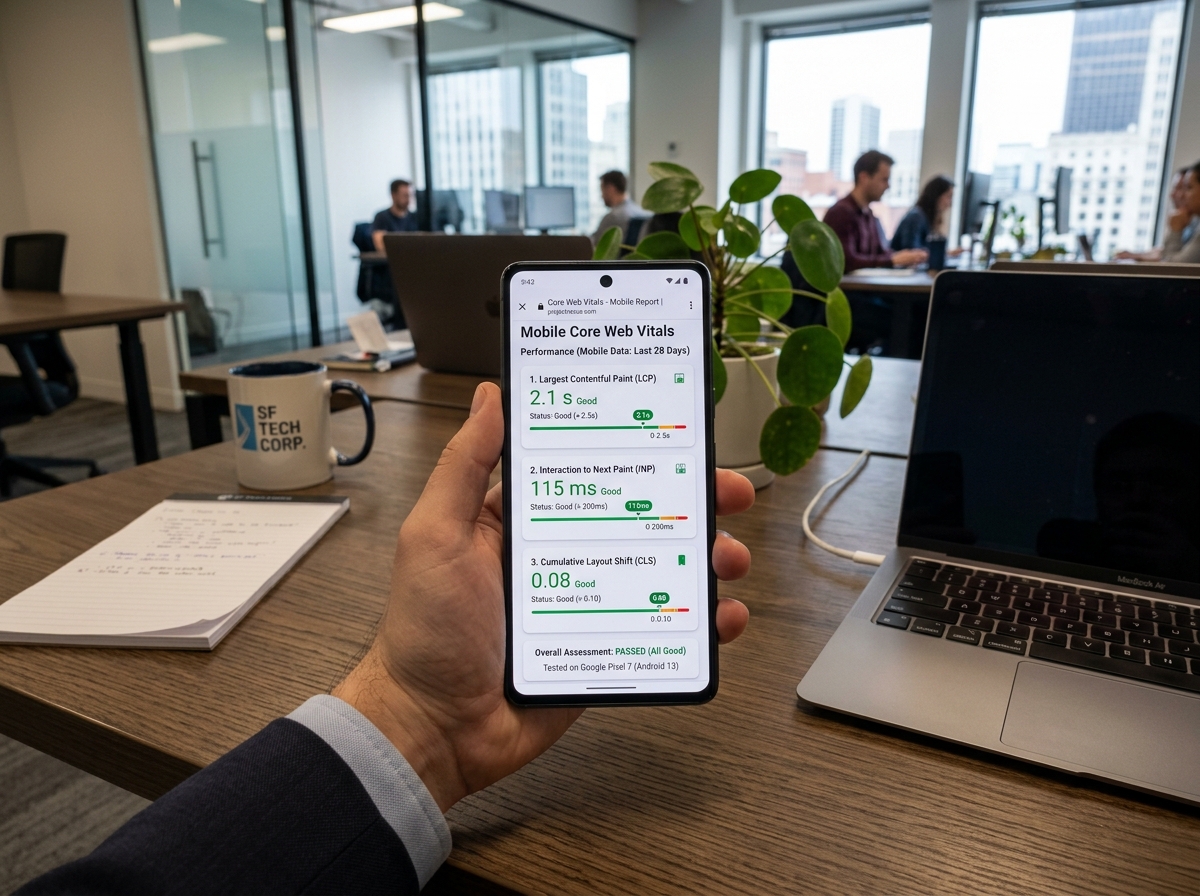
Performance is a ranking factor. Period. Google uses a set of metrics called Core Web Vitals, detailed in Google’s official Core Web Vitals guide, to measure the “health” of your user experience. On mobile, these metrics are even harder to hit because mobile processors are slower and 4G/5G networks can be spotty.
Understanding the Big Three Metrics:
- LCP (Largest Contentful Paint): How fast the main content loads. Aim for 2.5 seconds or less.
- INP (Interaction to Next Paint): How quickly the page responds when a user taps a button. Aim for 200ms or less.
- CLS (Cumulative Layout Shift): Does the page jump around while loading? Aim for a score of 0.1 or less.
To improve these, we recommend several technical steps. First, embrace image compression. We find that 9 out of 10 site audits reveal massive, unoptimized images that act like anchors on page speed. Moving to “next-gen” formats like WebP or AVIF can reduce file sizes by 30-50% without losing quality.
Next, consider your Albuquerque Website Development Services strategy. Minifying your CSS and JavaScript—removing unnecessary characters from the code—can shave precious milliseconds off your load time. Using a Content Delivery Network (CDN) ensures your site’s data is served from a server physically close to the user, whether they are in Los Alamos or Taos.
You should regularly audit your site using Google Search Console and PageSpeed Insights. Look specifically for “Mobile Usability” errors. Common culprits include:
- Blocked Resources: Ensure your robots.txt file isn’t accidentally hiding CSS or JS from Google’s crawler.
- Faulty Redirects: Don’t send mobile users to a generic homepage when they click a specific internal link.
- Unplayable Content: Avoid flash or proprietary video formats that don’t work on mobile browsers.
Working with a dedicated Website Designer and SEO expert ensures these technical “leaks” are plugged before they drain your rankings.
UX and Content Strategy for Small Screens
User Experience (UX) is the heart of mobile-friendly website design for SEO. If a user lands on your site and can’t figure out how to navigate it with their thumb, they will bounce. High bounce rates signal to Google that your page isn’t a good result for that search query.
The “Thumb Zone” is a critical concept. Most people use their phones with one hand. This means your most important buttons—like “Call Now” or “Book Appointment”—should be within easy reach of a thumb. We recommend touch targets of at least 48×48 pixels with plenty of white space (8-12px) between them to prevent “fat-finger” errors.
Typography also matters. A SEO Friendly Website Design Structure requires a minimum font size of 16px. If a user has to “pinch and zoom” to read your blog post, you’ve already lost them. Furthermore, Google penalizes “intrusive interstitials”—those giant pop-ups that cover the entire screen the moment someone lands on your page. If you must use a pop-up, make sure it’s easily dismissible and doesn’t block the main content.
Optimizing Content for Mobile-Friendly Website Design for SEO
Writing for mobile is different than writing for desktop. On a small screen, a five-sentence paragraph looks like a daunting wall of text.
- Keep it Scannable: Use frequent H2 and H3 subheadings.
- Short and Punchy: Aim for paragraphs of 2-3 sentences.
- Use Visual Aids: Bullet points and numbered lists are a mobile user’s best friend.
- Leverage Accordions: For long FAQ sections, use accordions or tabs. Google indexes this content even if it’s “collapsed,” and it keeps your page from feeling endless.
When you follow The Complete Guide to SEO Friendly Website Design, you’ll see that mobile-optimized content doesn’t just rank better—it converts better. A clear, scannable page leads the user naturally toward your lead generation forms.
Future-Proofing with Mobile-Friendly Website Design for SEO and AI Search
The way people search is changing. With the rise of AI Overviews and voice-activated assistants like Siri and Alexa, your mobile-friendly website design for SEO needs to be ready for conversational queries.
Most voice searches happen on mobile devices. People don’t type “Best SEO Albuquerque”; they ask, “Who is the best SEO company in Albuquerque?” To capture this traffic, you need to incorporate long-tail, question-based keywords into your content.
Schema markup (structured data) is also vital. This is “behind-the-scenes” code that tells search engines exactly what your content is about. Pages with proper “HowTo” or “FAQ” schema are significantly more likely to be cited by AI models and LLMs. For local businesses, ensuring your Website Design Albuquerque includes LocalBusiness schema is the best way to show up in the “Map Pack” and AI-driven local recommendations.
Frequently Asked Questions about Mobile SEO
Why is mobile-first indexing mandatory for all websites in 2025?
Google’s goal is to provide the best experience for its users. Since the vast majority of searchers are now on mobile, Google decided that the mobile version of a site is the “true” version. As of 2024, 100% of websites have been migrated to mobile-first indexing. If you don’t have a mobile-friendly site, Google has nothing reliable to index, which will cause your rankings to drop.
How does mobile page speed impact eCommerce conversion rates?
The data is staggering: a 0.1-second improvement in mobile load speed can increase conversion rates by up to 8%. In the eCommerce world, where more than 75% of sales are projected to come from mobile in 2025, speed is literally money. If your product images take too long to load, customers will abandon their carts and head to a faster competitor.
What is the difference between responsive design and a mobile-friendly site?
“Mobile-friendly” is a broad term meaning the site is usable on a phone. “Responsive design” is a specific technical method to achieve that. A site could be “mobile-friendly” by having a separate mobile app or a separate “m.” sub-domain, but responsive design is the preferred method because it uses one URL and one set of HTML, making it much more efficient for SEO.
Conclusion
At King Digital Marketing Agency, we know that a website is more than just a digital business card—it’s your most powerful sales tool. But in today’s market, if that tool isn’t optimized for mobile, it’s like trying to win a race with a flat tire.
From the mountains of Santa Fe to the bustling streets of Albuquerque and Rio Rancho, we help New Mexico businesses dominate their local markets. Our specialty is managing Google Business Profiles and map listings to ensure that when someone searches for your services on their phone, you are the first name they see.
Don’t let a poorly designed website hold your business back. Whether you need a full redesign or a technical SEO audit to boost your mobile performance, we are here to help. Learn more about our digital marketing services and let’s start building your mobile success story today. Your customers are already on their phones—make sure they can find you.
